Below are the series of adverts made. Out of the six sketches, I have made four products: the illustration I have made for the “Graphic” and “Dynamic” adverts were unsatisfactory or unrealistic to be made at my level.
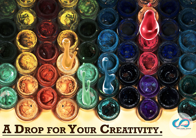 |
| Paint Drop Ad |
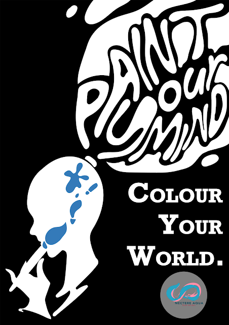 |
| Minimalistic Typography Ad |
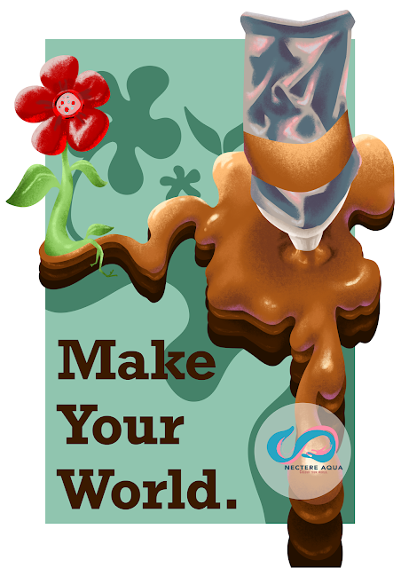 |
Environmental Style Ad
|
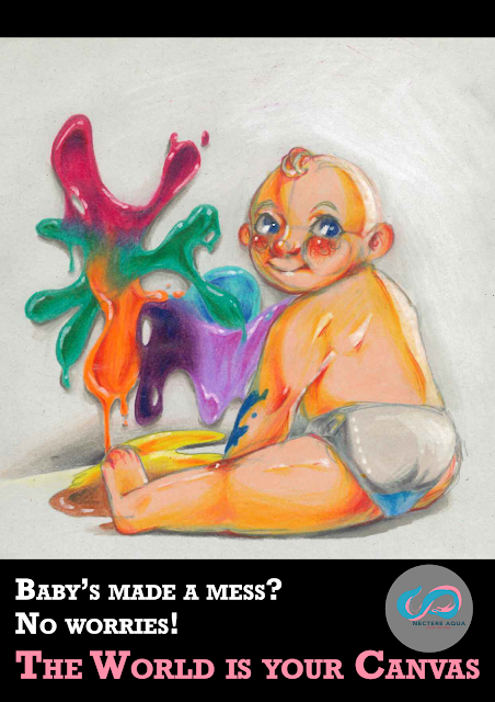 |
| Funny Baby Ad |
Reflection:
Out of these advertisements, my best pick is the minimalistic ad. I like how crisp and flowing the text looks like, and how the overall shapes show a paint brush shape or flowing paint. However, the monotone colours are not very effective in advertisements, it just isn’t catchy enough to capture the viewers, and the text may not be legible to people without context. The logo in general is a problem too: the design itself is alright, but the placements of the logo is somewhat awkward or off putting in the actual advertisements. Nonetheless, there are some good points I did such as the unity of fonts and common themes (like flowing paint) to give the ads link between each other.


Very good work on thsi and good clear presetation of your ideas, good that you tried different ideas and you explored the good and bad points of each - excellent work Grade 'A' for your advertising work
ReplyDelete