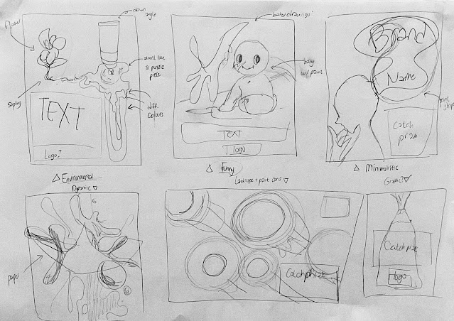
After I searched for enough references, I started to create some sample sketches for my advert. I have made a total of six sketches, of which they all have separate themes such as comedic, graphical, and minimalistic.
As seen above, I made six sketches for my adverts. Out of these, I excluded the “dynamic” (bottom left, 4th image) as I had imagined to make a hyperrealistic advert like a drink or perfume ad utilising splashing liquids, but I had no realistic way to do that in time. So, I began with making the other five adverts. I first started making a logo:
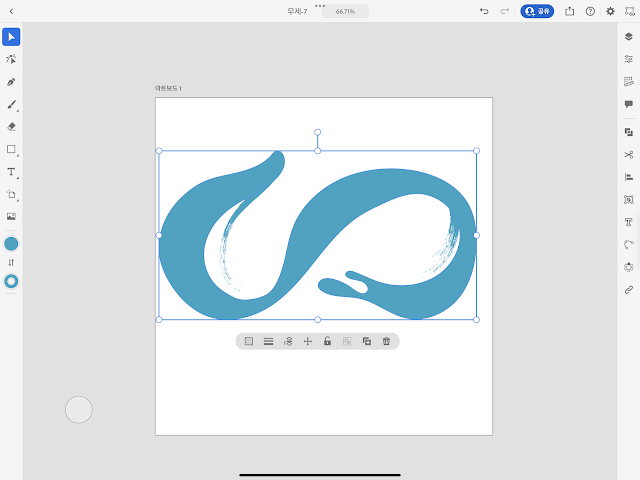 |
| I used the Adobe Illustrator app in iPad, and drew a basic S shape using the brush tool from the tool bar. |
 |
| I copied the initial S and modified its colour and shape. Then I added the company name and catchphrase. Although not seen here due to the background, there is a semi-transparent circle behind the logo. |
 |
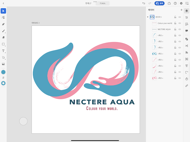
| This is the final logo that I will be using. |
 |
| This is another logo I made for practice; I used the same app as the first logo, but used the shape tool to make the circle. |
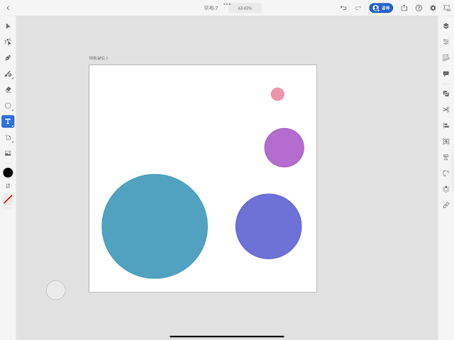 |
| I copied the circle then resized and recoloured them. |
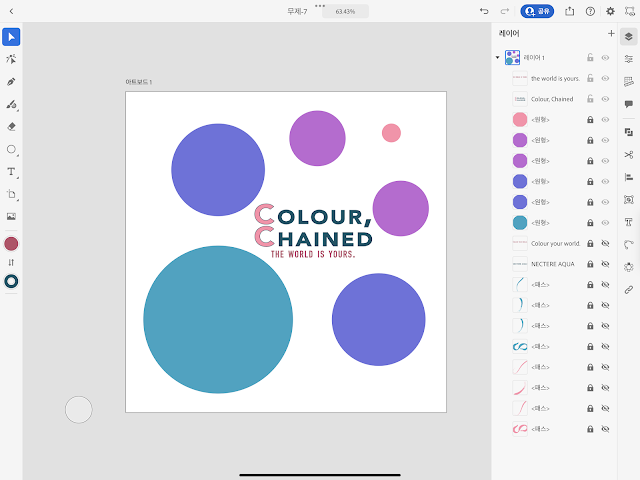 |
| The shapes were made into a circle ring, to which the company name and catchphrase was put in the middle of the ring. |
 |
Another logo made.
With the logo completed, I started working on the different advertisements.
Environmental Ad | | I began by drawing basic shape with the Procreate app on my iPad. |
Minimalistic Ad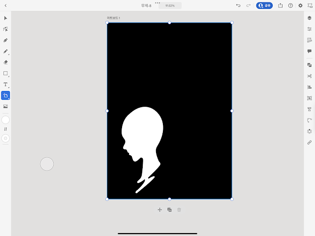 | | This time, I made the illustration on the Adobe Illustrator on iPad. I used the pen tool from the tool bar and began drawing the outline of the head. |
 | | I added a hand and the brush handle to the head using the same tools. |
|
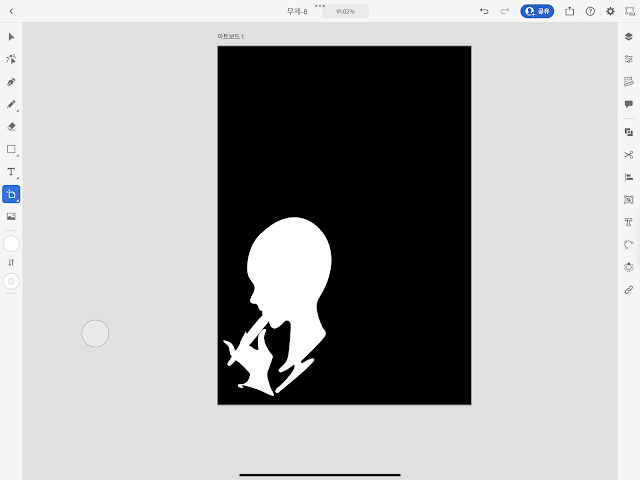
Some decorations were added beside the text.
I drew a fluid text saying Paint Your Mind using the same tool.
|
Landscape AdI grabbed a stock photo from Unsplash and imported it onto Photoshop.
The white space beside the image looked awkward, so I mirrored and connected the image using the spot healing tool. I drew some random fluid bubbles with the brush tool.
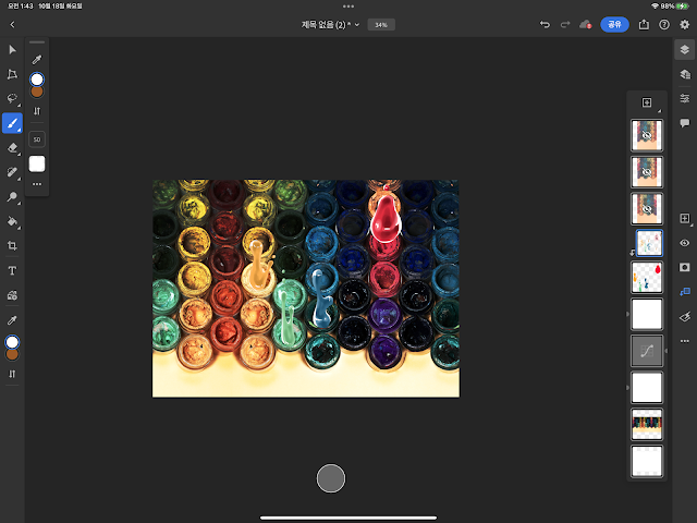 Then, using the same tool, I added highlights and shadows to make it more detailed. Then the catchphrase and logo were added.
Funny Ad
The base tone was added using the Prisma colour pencils.
Shadows were added, with special focus on the baby's face.
A white colour marker was used to place highlights.
More details such as the rosy cheeks on the baby and sone outlines were drawn.

The illustration was scanned using the scanner available at the Kimberlin Library.
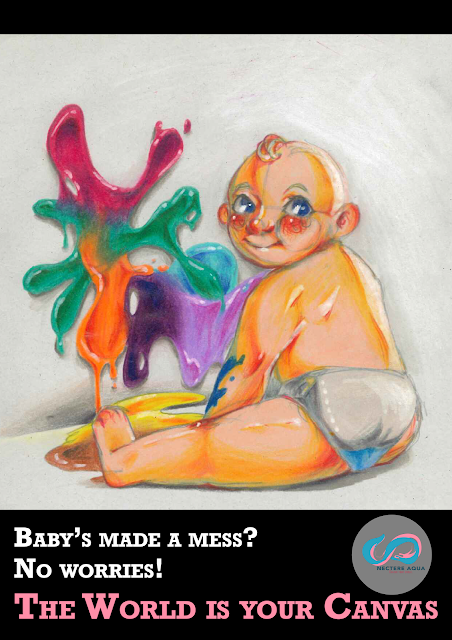
The image was imported onto Photoshop, where the tagline and logo was inserted.
Scrapped Idea: Graphic AdA sketch similar to the beginning of the funny ad was made.
Cobalt blue marker was then used to paint the midtone.
Using Azalea Purple marker as contrast;
Then adding Vivid Green and Orange volcano on top.
Used white marker as finish.
As mentioned above, the last idea was scrapped due to decreased quality and my dissatisfaction with the work. Therefore, the image wasn't processed onto Photoshop like the others but is still included as a part of the process.
Lastly, I will add my reference for the stock photo used in the advertisement.
References:
|
Richer, S., (19th Nov.2020) Unsplash, red green and blue round plastic containers photo [Online] Available at: https://unsplash.com/photos/9rKSUbYaric (Accessed 17th October 2022)


Good technical work and I like the mixture of digital and traditional - this worked well for your advert - good detail and thought - well done
ReplyDelete