Skills Week: Composition, Image and Text
This workshop was intended for all Graphic Design students and was especially relevant to me as I had to create a magazine cover, meaning I have to best utilise the arrangement of texts and images in my composition. To not take too much time in the creation, we used a collage technique using magazines. As this process helps us get images that are already produced, we would not have to spend time in creating the work from the foundation. Additionally, we were given keywords to put as a text in its creation so it was easier to anchor the work.
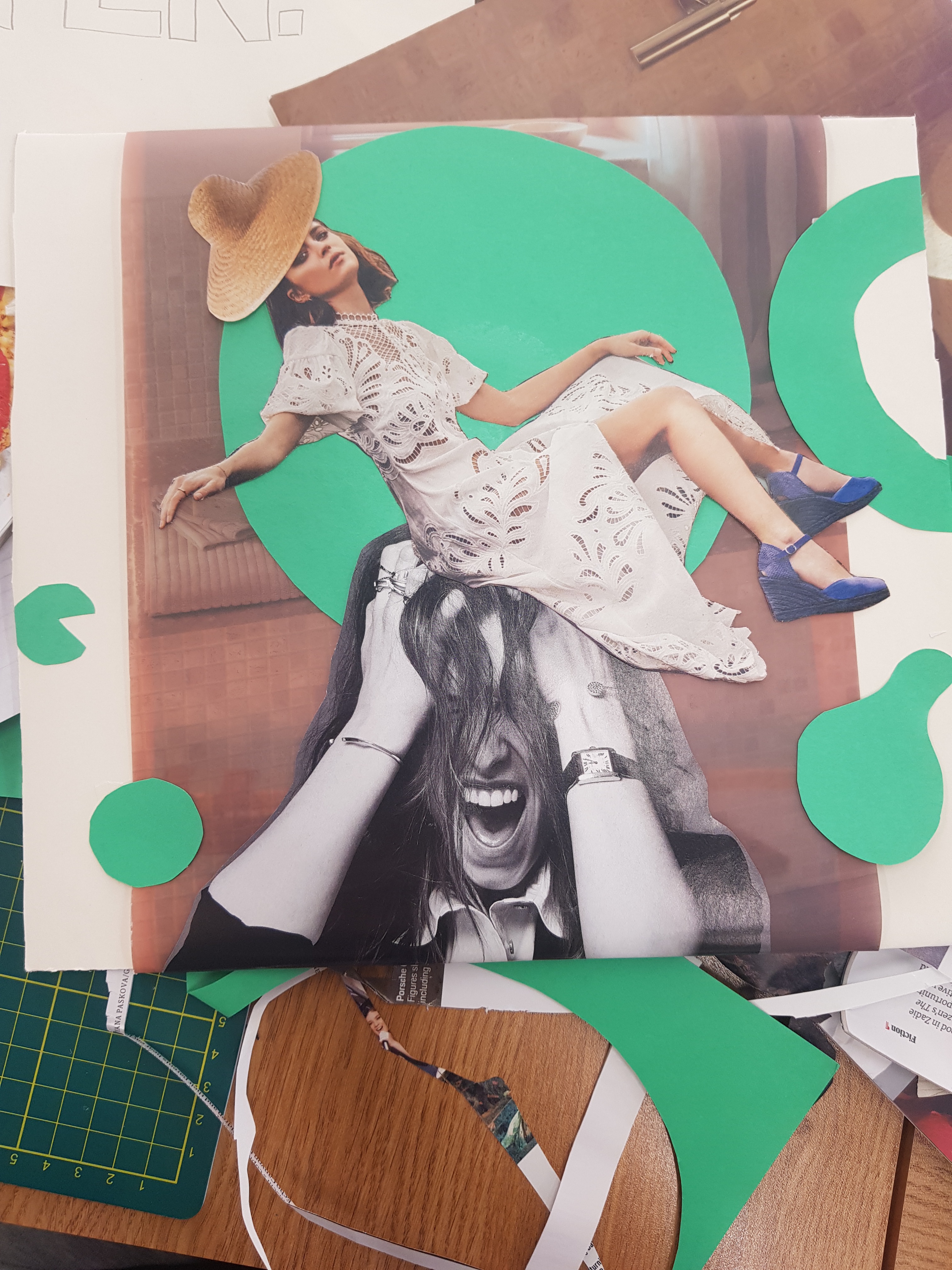
This was a part of the process after cutting selected images out of magazines; I was aiming to create an advertisement for a vacation business for stressed, burnt out people. The background image is actually composed of two pictures, one of a beach background and the other (upper) one of a sepia tone interior, and the goal of this was to show a vivid vacation background under a semi-transparent image. However this did not work quite well, especially due to the dark sepia tones, and therefore the vacation background cannot be seen. To make up for this, I added some teal circles for some additional colour and a feeling of liveliness to the image.

Among the given keywords I chose ‘Listen’ to put into my work, trying to give it a meaning of ‘Listen to your inner self and take a break’. I attempted to make the composition central to draw the viewer’s attention to the woman in the centre first then lead them down to the text by following the teal circles, and while I believe it works to some degree, the text could have used a darker outline to contrast more with the images. However by doing this, I feel like I gained a better grasp on how to effectively arrange images and texts to draw the viewers in. As my tutor said, the image I have created a propaganda-like effect, and propaganda is one of dominant ways to attract attention.
 |
| Final image. Tutor comments that it is almost propaganda-like. |


Perhaps you could include some works by John Heartfield or Barbara Kruger which we looked at in the session to demonstrate how Graphic Designers get their ideas/messages across in their work as a link to what you did in this session.
ReplyDelete