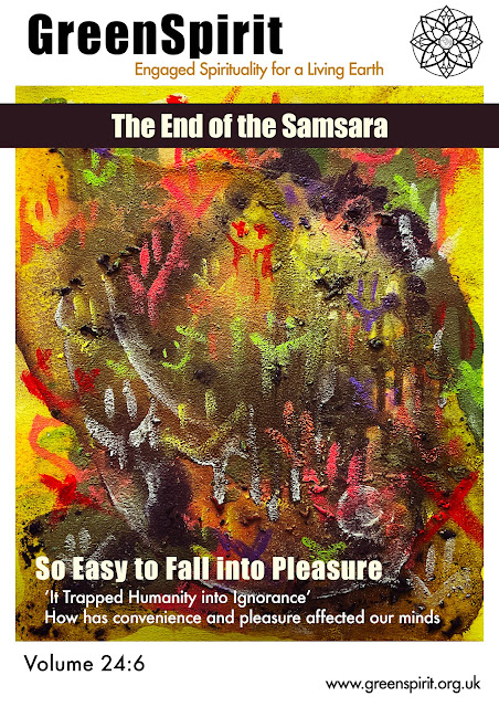
Magazine Cover Creation
I have attempted to scan the finished fluid art illustrations, however the scanners could not detect the canvas so I took clear photos with the best of my efforts to be used for my mockups. I have done this through the Photoshop application on my iPad, and below are the screenshots of my process. I used the base canvas of A4 which was one of the common sizes used in magazine prints followed by Letter (8.5” x 11”) and A5. I used two different fonts in this, Impact for titles and Futura for other texts, as they have a clean and blocky look which look more modern and professional compared to the fonts used in GreenSpirit’s magazines. I believed that this clean look will be more attractive to a wider market, especially for the youth compared to fonts such as Times New Roman. I had originally designed this with a black background, however it looked more like a movie poster so I have changed to a white background.
Process screenshots of the process
I have created two versions of the magazine for testing, one with a coloured logo and the other with the outline version. I have decided that the outline logo looked much cleaner an professional, and have used this design for further processes. Below are the finalised cover designs of the six illustrations. Selected few will be used in mockups, to be shown in later post.


Comments
Post a Comment