Posts

Showing posts from October, 2022

Project Plan: Media Mix of Old Novels

Image
A project plan has been visualised for better outline for following. Further details will be posted as it is being done. Link to Project Plan  

Project Sign Off: Media Mix of Old Novels

Image
As of 26 October 2022, my project has been signed-off and given the signal to progress. Before I make a concrete outline, I will show some samples of works I will be researching. Below is the work of Saul Bass, a American graphic design and well-known cover designer for movies, albums and books. He has unique takes on designing covers, opting to keep it minimalistic and in a limited colour palette. Since I am also designing a type of covers, it would be interesting to analyse how he came up with such designs in relation to the work covered. These researches will help me design more detailed and in-depth covers for products. Album cover for Duke Ellington's music from the motion picture Anatomy of a Murder, 1959, Saul Bass Exodus, 1960, Saul Bass Link to Project Sign-off

SMART Objective: Media Mix Illustrations for Product

Image
Media mix between Dune (novel, 1966) and Dune (movie, 2021) For my graphic design (illustration) project, I will be creating a set of illustrations of old novels such as 'To Kill a Mocking Bird' or 'Pride and Prejudice' as a product of another form.   It is a digital project made off of an old novel as the target audience (Gen Z) are more hesitant to old literature, I will be making it into a modern product that the youth will be more willing to dive into. This will be a set of at least three media mix illustrations for the product. I will first create sketches on the main product and the media mix projects (main product is old novel, media mix project is a game, movie, or comics) containing concepts of composition, different art styles, the product it is going to turn into, the orientation of the sites it is going to be used in (Gen Z use different social medias), and more. The final product completed by the deadline, which is the beginning of December.

Idea Generation using Milanote: Major Project!

Image
I have created an idea board using Milanote, where I listed down some examples on how media mix projects were processed and used. Then, I have noticed that this types of projects are often animation-based and targeted toward Generation Z (fast-moving, internet culture-tuned, so on). As these projects are commonly done through studios, of which what I found that were specialised in these types of project were Studio K110 (Korean Studio) and Psyops (American Studio), so I will research more into their projects and apply my idea, the media mix for old novels, to such techniques. Link to the board in Milanote

Ideas Generation for Major Project

Image
For my major project, I would like to focus on making illustrations for multimedia or mixed media projects. This is more common for projects now: books don't stay as books, but they also become podcasts, animations, games, and other works that often seem unrelated to the original content. This is commonly used in genres that require active participation from the audience; games, animations, and books use this method often to promote their work.  One famous example of this from the game Cyberpunk 2077: the game itself was considered a massive failure, but it had a media mix project with an animation that somewhat healed their poor reputation. Multimedia Project for Cyberpunk 2077 Game Cover Illustration by IGN (left), Animation Cover Illustration by Netflix  (right) Although the styles are very different, it creates an interesting contrast with the same initial concept that would normally not be seen in a single media product. Another famous multimedia illustration for the Disney m

Blog Buddy Review: Advertisements

Image
The initials ideas, for me, were clear: her research showed the idea she wanted to show and to which points she wanted to highlight, but the development to the final product was not very clear. She skipped on most processes, and had not placed much personal comments which could've helped. The research, while related to the source and motif used, does not say much about why she chose such sources nor were they actual adverts. Only one of the pictures was an advert; the other three pictures were simply photos with headphones. It would have been helpful if more adverts with similar themes or adverts with similar composition were used during the development. The process was not clearly stated: tools used, which application used, and more were not stated, so it would be beneficial if such details were added. It would also be helpful if there was a motif and process in making the logo. Additionally, there is not much commentary on the process: saying little notes such as what and why wer

Final Adverts!

Image
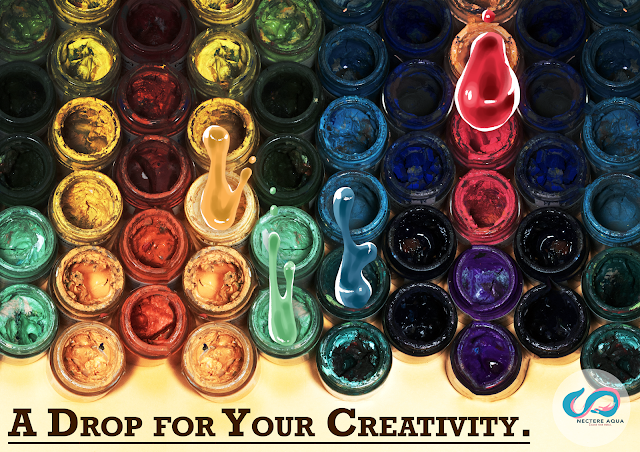
     Below are the series of adverts made. Out of the six sketches, I have made four products: the illustration I have made for the “Graphic” and “Dynamic” adverts were unsatisfactory or unrealistic to be made at my level. Paint Drop Ad Minimalistic Typography Ad Environmental Style Ad Funny Baby Ad  Reflection:    Out of these advertisements, my best pick is the minimalistic ad. I like how crisp and flowing the text looks like, and how the overall shapes show a paint brush shape or flowing paint. However, the monotone colours are not very effective in advertisements, it just isn’t catchy enough to capture the viewers, and the text may not be legible to people without context. The logo in general is a problem too: the design itself is alright, but the placements of the logo is somewhat awkward or off putting in the actual advertisements. Nonetheless, there are some good points I did such as the unity of fonts and common themes (like flowing paint) to give the ads link between each othe

Process for the Final Advert

Image
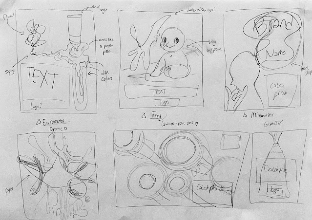
After I searched for enough references, I started to create some sample sketches for my advert. I have made a total of six sketches, of which they all have separate themes such as comedic, graphical, and minimalistic. As seen above, I made six sketches for my adverts. Out of these, I excluded the “dynamic” (bottom left, 4th image) as I had imagined to make a hyperrealistic advert like a drink or perfume ad utilising splashing liquids, but I had no realistic way to do that in time. So, I began with making the other five adverts. I first started making a logo: I used the Adobe Illustrator app in iPad, and drew a basic S shape using the brush tool from the tool bar. I copied the initial S and modified its colour and shape. Then I added the company name and catchphrase. Although not seen here due to the background, there is a semi-transparent circle behind the logo. This is the final logo that I will be using. This is another logo I made for practice; I used the same app as the first logo,

New Idea Generation and Research for Final Advert

Image
     Public paint adverts, especially if it is paint used for artworks, is rare to find as the target audience is often extremely closed off from the common people. So, based on adverts that carry a similar imagery and idea that I have shown previously, I searched for advertisements that had similar concepts, techniques, or compositions that I was aiming for.  Suarez & Clavera (2015) Chupa Chups Ad Found in: Canva     The image above is an advertisement from Chupa Chups for Mexican audience in the year 2015. Although the official video advertisement is gone now, images carrying sections still exist on the internet. The use of text as an image, in this case a shape of the lollipop, is a style of advertisement I often see for food products. Instead of the common 2D text style of ad, this instead used 3D text with clear lighting to give it a shiny, realistic circle to give it an illusion of an actual candy. This is one of the type of advertisement that I would like to make, albeit in