Posts

Showing posts from November, 2022

Ye Olde Covers - Final Work Process Part: Animal Farm

This is the second part of the illustration creation process to be edited on Photoshop. The tools used are the same from the process of Moby Dick. Animal Farm Collage Style Book Cover Animal Farm Collage Style Animation Poster  Animal Farm Collage Style Movie Poster Animal Farm Collage Style Game Cover Animal Farm Minimalistic Style Book Cover Animal Farm Minimalistic Style Animation Poster Animal Farm Minimalistic Style Movie Poster Animal Farm Minimalistic Style Game Cover Animal Farm Abstract Style Book Cover Animal Farm Abstract Style Animation Poster Animal Farm Abstract Style Movie Poster Animal Farm Abstract Style Game Cover Pictures used in Collage Styles: Broken Boat PNG by pngfind Legs PNG by pngimg Blue Whale PNG by FreePNGLogos Man Sitting PNG by kindpng Hay Roll PNG by PNGEGG Barn PNG by  PNGEGG Pig PNG by  PNGITEM Meat Chunk PNG by PNGEGG Sausage PNG by PNGEGG Senior Man PNG by Rawpixel

Ye Olde Covers - Final Work Process Part: Moby Dick

Before starting the final process, I have researched basic dimension and DPI sizes required for standard posters or covers: ---------- Trade Paperback covers :  ( 1:1.5 proportion , 1800 x 2700  [6" x 9" as pixels] or  1600 x 2560 px) UK standard  film poster :  (One sheet, 27" x 40") Procreate cannot handle this size, so scale down  (Scaled down to 16.2” x 24” , same proportions) Animation poster :  N/A, use any template from A4 to A1 (used A4) Game cover : N/A, use standard DVD size case ( 5.1"x7.2"  one side without spine) RGB format,  300 DPI ---------- Then, I started working on the covers. As the process had taken several steps and a several hours, I have recorded a time lapse of the process using the Video function in iPad Procreate. I have used the Script brush tool and Monoline brush tool in the basic Procreate Script tool, with noise brush and Gaussian blur function on top for collage styles, set and the fill colour function ...

Ye Olde Covers (Major Project): Further Sketching

Image
I have further sketched out covers based on different themes: this time it is based on psychedelic theme and realistic, collage/paper-cut style theme. But before that, I had created a small mind map on what I'd like to put in my covers. Key words for my covers Below are the sketches I made based on themes: Psychedelic+Old style theme Collage/Paper cut style theme

Wix Website: About Page, Social Links, Homepage and Mobile View

Image
As I have already changed the text in my About Page last week, I replaced the font type of 'ABOUT ME' to Lulo Clean at 25 px  size, whereas the text of the paragraphs are Open Sans at size 16 px, for more emphasis. Then I have used the Change Image option on the stock photo to replace it with my portrait taken during class. Website preview after editing. I have tested out the About page on the mobile view whilst still on the preview mode and while it was fine, with no major problems. I have, however, adjusted the paragraph size as it had looked quite thin compared to the page size. On the other hand, the format for my Home page was broken, so I had to readjust the size of the header to 18 px and 9 px for title and subheading respectively. I had also edited the size of the catchphrase to fit into the screen. I placed a social link bar that I have found in the 'Social' tab of 'Add Elements', then removed unnecessary social media icons. After linking the proper ico...

Further Research: Takashi Murakami

Image
Before futher work, I have looked at Murakami's works, who's cover illustrations uses bright, 'pop' colours and cartoon styles, which Murakami used to advance his  'Superflat theory of art, which highlights the “flatness” of Japanese visual culture from traditional painting to contemporary subcultures in the context of World War II and its aftermath ' (Gagosian, 2018). I felt his work better suited the current niche of the youth, to be simple, colourful, and impactful, which is an element I need for viewers to be attracted to an cover design of old novels. While some works of Saul Bass and Paul Rand can be relevant, there are works that the target audience, Gen Z, may find more attractive and relatable.  Takashi Murakami (2007) Cover Art for Graduation Found in: Dezeen Murakami, also known as the Warhol of Japan, states that  'Kanye’s music scrapes sentimentality and aggressiveness together like sandpaper, and he uses his grooves to unleash this tornado that...

Photoshop Software Concept Testing

Image
Working with editing software such as Adobe Photoshop is essential in Graphic Designs and other graphical works, so I did some practice works on it. I started off by choosing my page template; I chose Tabloid in Portrait orientation as this format is a standard for small poster prints. Wrote down a title and concept of work, then took a stock photo from Unsplash that works as a mock up photo of my work. I added more explanation for the concept, and changed the font to make it look less bland. I made a logo from  LOGO  website which I placed on the concept image.  Final product exported as .png file.

About Me Page for Website

Image
Yoonji Lee, known by her friends as Jenny.  Opting to move between cities and countries to expand her mind, Jenny  has not settled on a single place for a long time. When Jenny is in her mental closet, every little idea and obscure thoughts become an inspiration. Jenny has always created art; no matter where she was, she would sketch and develop. Her school may not have been supportive of arts, but  Jenny's passion brought her to where she is now. To better develop her art skills, many people have inspired Jenny including her teachers, parents and friends. De Montfort University (DMU) is her current destination, again choosing to go out of her comfort zone for fresh experiences. Although working for some illustrations for friend and relatives, she chose to better develop her skills in Graphic Design (Illustrations). Jenny hopes to create her own illustration series built upon old cartoon stories her younger self made. --------------- [Proofread and edited About Me text] I...

Further Research: Paul Rand and Jacob Escobedo

Image
For this week, I have further researched three artists mentioned in the project sign-off: Paul Rand and Jacob Escobedo. Paul Rand (1946) Origins of Modern Sculpture Paul Rand Design Rand’s works uses a distinct cut-out style, mixing realistic images to graphic illustrations.  Paul Rand (1950) Switzerland Builds Paul Rand Design Although using abstraction like Saul Bass, their usage and style of it. Rand shows the contents of the product directly with an image highly relevant to it, showing architecture photo for an architecture book, so on, while Saul Bass goes to twist the meanings onto his covers. His works incorporate every element of a cover— the texts, lines, colours— as a whole illustration cover. Grapheine (2022) quotes that ‘ Rand was convinced that the strength of graphic design lies in its ability to be a universal language, through the simplicity and geometry of its forms.’  Additionally, Britannica states that 'Rand believed that lines, shapes, and colours could b...

Practice Sketch Development for Major Project

Image
Before I went into the proper development of the cover illustrations, I made some idea sketches for my topic. I chose Moby Dick and Animal Farm for my topic novels: they are widely known where most English natives would know the title, but many do not know the actual contents of the book. Based on my research of Saul Bass, I created 8 sketches, 4 for each novel and each sketch showing different products. Made using Procreate on iPad

Website Research of Heather Shaw and Aries Moross

Image
Beginning the creation of my website, I have felt the need to research more on website portfolio samples of other active graphic designers. Amongst many, I have chosen Heather Shaw's website  and Aries Moross's website . They both have distinct designs and user experience, so it would work well for a compare and contrast study of the websites. I will be considering the layout or visuals such as colours and typography of the works present, the theme of the website in consideration of their work styles and arrangement of menus and navigation system, how the website works across different gadgets, and general usability, then comparing how they were effective in immersing the viewers. I will begin by showing the homepage of Shaw's website; She has chosen a dark tone for her background so that she would be able to colour code and emphasise her series of works; however, there is quite an amount of blank space on top her name, and despite faint photo placed in the background, I fe...

Wix Website Creation Part 1

Image
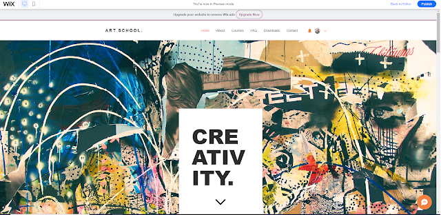
For this post, I will be talking about the first part of website creation through Wix. Further posts will come to narrate my progress.  Template chosen for website, will be edited for personal use Edited the title to my name and my progression route; the font used was Lulo Clean as it looks clean, sharp, and legible. Font size 37 for the name for emphasis and size 20 for the progression. I have changed the menu bar to have the contents I want; the Course tab, now changed to Portfolio tab, could not be erased due to it being a core page so I have simply changed the name to be edited later. The copyright was changed to my name and the correct year, then went through other tabs to check if the edited copyright is properly put. Some stock illustration photos were downloaded and uploaded onto Wix. A photo will be chosen to replace the background. The photo was used to replace the Wix photo present in the template, then I changed the text originally present in the text box. I have chosen...

Media Mix Initial Artist Research: Saul Bass

Image
As media mix is a project crossing several different products, I will be looking at designers and artists of different projects. I will be starting with Saul Bass, a famous graphic cover artist working with albums, books, movies, and posters.  Saul Bass (n.d.) Vertigo Movie Poster Found in: Area of Design Saul Bass says: 'I  saw the title as a way of conditioning the audience, so that when the film actually began, viewers would already have an emotional resonance with it.' (Bass, n.d.). He interpreted his cover as an experience of a work prior to the actual experience; simply looking at his cover will immerse you into the product before you have seen its contents, whether it be music, movie, or book. He breaks down the elements of the contents literally and figuratively, then illustrates that into simple and minimal graphic cover. As seen above, the pattern used for the poster can be linked to the sense of vertigo, which is the title of the movie, and the characters seem like ...